


Art Style Exploration of Godwalker
How do you explore different art styles and mediums to find the one which best suits your project?

Introduction
Throughout the time I’ve spent working on Godwalker I’ve been trying to figure out what kinds of visual styles would compliment the game as a whole. In this section I aim to explain my full process of exploration as a whole thus far, through Minedroid, Rock Hopper, Praetor, and Godwalker.
As a whole this section is here to show you the process of iteration I went through in attempting to find an art style, the struggles I’ve faced, and specific aspects that I’ve learned through these attempts. Overall this is a process of continued failure which I am approaching with the mindset of “nothing is set in stone” so that I may change and modify all elements to benefit the game if I feel the need to.
Minedroid and Rock Hopper’s Visuals
When working on Rock Hopper I needed to find a method of creating visuals for the game the conveyed a level of detail without a high level of production value. The typical 3D art production process of model in one software, paint in another, and import into Unity wasn’t going to work here. That level of production was too high detail and was going to take far too long to implement. To combat this, I managed to come up with a method of modeling, texturing, and rendering all art assets within Unity itself.
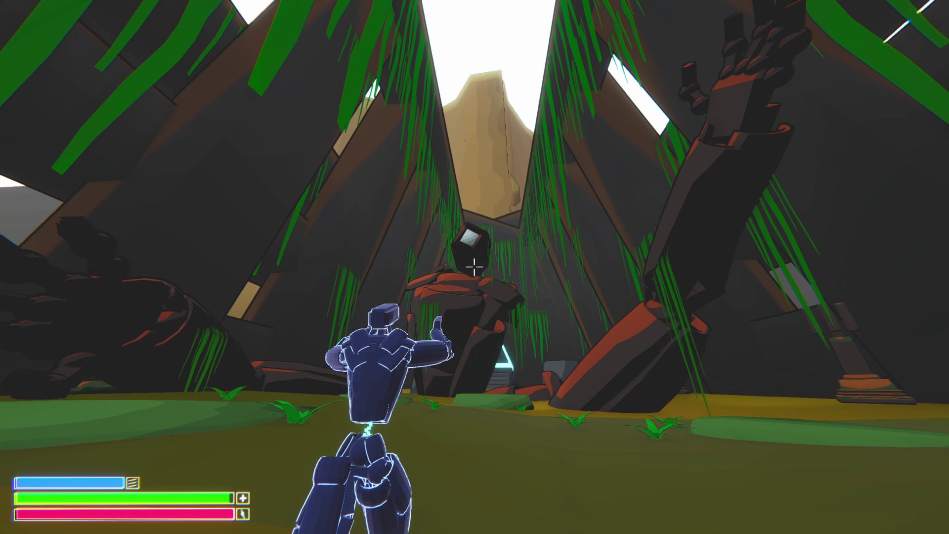
Scene from Rock Hopper in which the player encounters one of the fallen mechs
To do this, I very carefully modeled everything in the game using Unity’s proprietary modeling tool, ProBuilder. ProBuilder UV’s every model in world space, which meant I could apply world space dependent shaders to them without any issues. Using Unity’s default non-UV’d primitives for whiteboxing would have left me in the dust.
So, now that I had a method of semi-cheating both the modeling and UVing sections of art production, I needed a way around the texturing. I started by actually trying to figure out what kinds of information I needed to convey - I performed a few art tests in which I brought assets into Substance Painter in an attempt to see just how long manual asset production would take. Just as I had hypothesized, even with small low-detail assets, it was going to take far too long. The results yielded interesting assets with strong visual clarity, but they were not efficient enough to produce, nor visually appealing enough to warrant the long form of production.

Earlier test from Minedroid in which I textured the player character using Substance Painter, in an attempt at a high end production pipeline
Faced with this issue and only about three weeks to texture the whole game, I decided to take a step back and ask myself what context I needed to convey in the world. Rather than making textures for the environment to convey things like metal, rust, flora, stone, etc., I decided to focus on primarily using color and shape.
A few months prior, I experimented with vertex coloring to make environmental aspects, but I found that it did not convey nearly as much detail as I would have liked. From there I experimented with the portrayal of depth by using volumetric fog, which helped a bit, but I was very limited by the technical limitations of the Built in Render Pipeline rather than the Universal Render Pipeline.

It’s clear in the screenshots above that this is some kind of crevice or valley in the midst of a red desert. The color toning, fog, and shadowing suggest it’s outdoors, and the random jagged shapes of the objects tell us it’s a natural formation.
I spent some time considering how these different aspects contributed to the overall visual language. One of the strongest aspects here is the change in coloration on the walls. Compared to the floor, the walls have vastly more interesting surfaces to look at. They feel natural, but more than that, they blend differently with the direction of the sun.
Pursuing this idea further, I began looking into different shader libraries to portray color, depth, sun direction, and specular maps in a more stylish way.

I began with some simple shapes, using cel shaded materials to give the objects more presence and life. I played with different color schemes and tried to figure out what information they could convey. Additionally I explored how rim lighting, shine-ness, and outlines could create more highlighted objects to stand out in the environment.

Using these methodologies, I began conceptualizing simple assets which incorporated concepts of color, shape, directional lighting, etc., into more cohesive elements. Above is a set of rocks, each of which uses a slightly different color toning and lighting set. After this I was convinced I had found an art style with potential, and began building out more and more tests.
Shown Below are two environmental art tests. On the left is an environment built and shaded to resemble a forgotten valley, while on the right I went for a more desert and cavernous vibe. Both scenes use similar object setups and share some assets and materials, but ultimately convey different vibes entirely.

Example Environment A: Valley
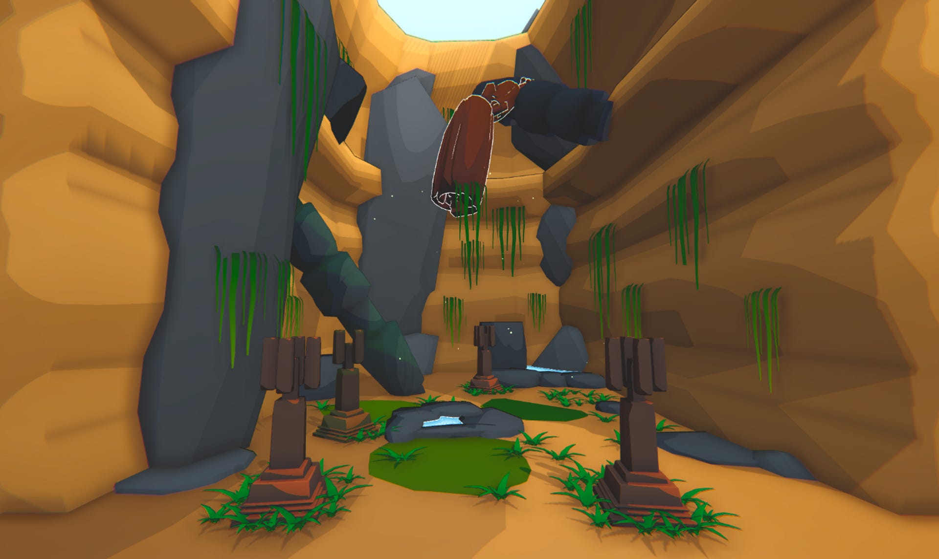
Example Environment B: Desert
There are a few tricks at work here that allow me to convey lots of different bits of information. In both scenes, to different degrees, I am using sub-meshes with a abstract directional light pointing down directly on top of them. I then mask the rest of the shader and only use a single cel layer to create a wide sun baked effect. When applied to objects correctly, this material actually resembles moss.
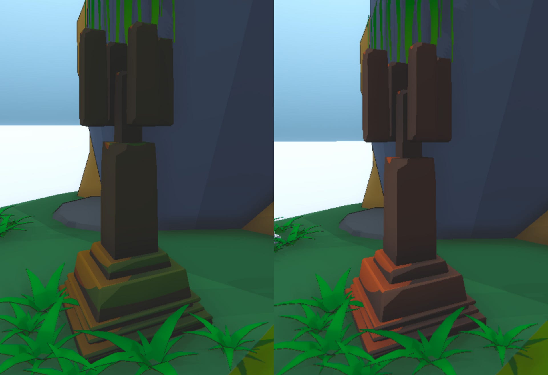
Example displaying a pillar asset with and without moss
As you can see from the example, adding moss to an object brings it significantly more inline with the color scheme of the rest of the environment.

Moss can be seen everywhere in the environment. In this zoomed in screenshot of the valley art test, we can see it applied to one of the two pillars, diversifying the asset to quickly reuse it, applied to a large pillar to bring out more of its depth and shape, and on the walls of the environment itself to highlight the vertical changes in its normal map.
Using this set of tools I was able to give environments a much needed level of detail and attention in a significantly shortened amount of time. This methodology satisfied my need for artistic detail and was extremely efficient. The actual action of set dressing the entire game took less than the two weeks I had allotted. In fact, the majority of that time was spent tuning and refining the colors and aspects of rendering.
So, I had met my conditions for artistic expression and production efficiency - but what’s the catch? Without knowing I had unfortunately walked into a trap. Because these materials update specific aspects each frame such as highlight shape, rim lighting calculations, and Unity shadow and light based parameters, these materials could not be batch rendered.
⚙️ These materials were built using FlatKit’s rendering library. As of updating this article it appears FlatKit now supports the URP render batcher, and is super efficient. This effectively renders this entire section of the article moot, but if you’re interested in how I combatted this, read on!
This meant that instead of the game drawing multiple assets at once to retain efficiency, each rendered frame drew each asset individually, which instantly turned this into an unoptimized mess. Play testers reported framerates of 10 fps at times in specific areas. In my flurry of graphical exploration, I forgot about one key aspect: optimization.
Thankfully at the start of the semester I had scheduled an additional two weeks for bug fixing and polish. It was during these two weeks that I learned all about instancing materials, compute shaders, dynamic occlusion culling, and load zones. All of those buzzword sounding things should be familiar to other game developers reading this - they’re basically methodologies and tools used to make a game more optimized.
First I built load-zones so that the player never rendered anything they couldn’t see. Rock Hopper’s environment was sectionalized off by a series of doors, so I could easily chunk rooms and only show the visible ones. This didn’t work as well as I would have liked it to, so I built a series of dynamic occlusion culling scripts to turn mesh renderers on and off depending on their visibility. I incorporated that, along with some high density static occlusion culling maps, and I started to have a game that would run at 20 fps.
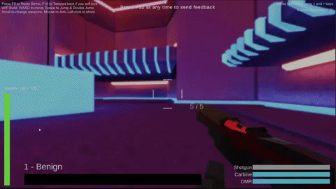
After that I began to isolate render-intensive elements, and found that all projectiles were incurring a huge level of stress on the render thread. My rendering of them was simple - I built a fresnel shader which used a 9x9 dot matrix to determine intersections with the ground. It looked like a bubble that could touch stuff. In the screenshot below you can see some projectiles intersecting with the ground, which is why they are not a perfect circle.
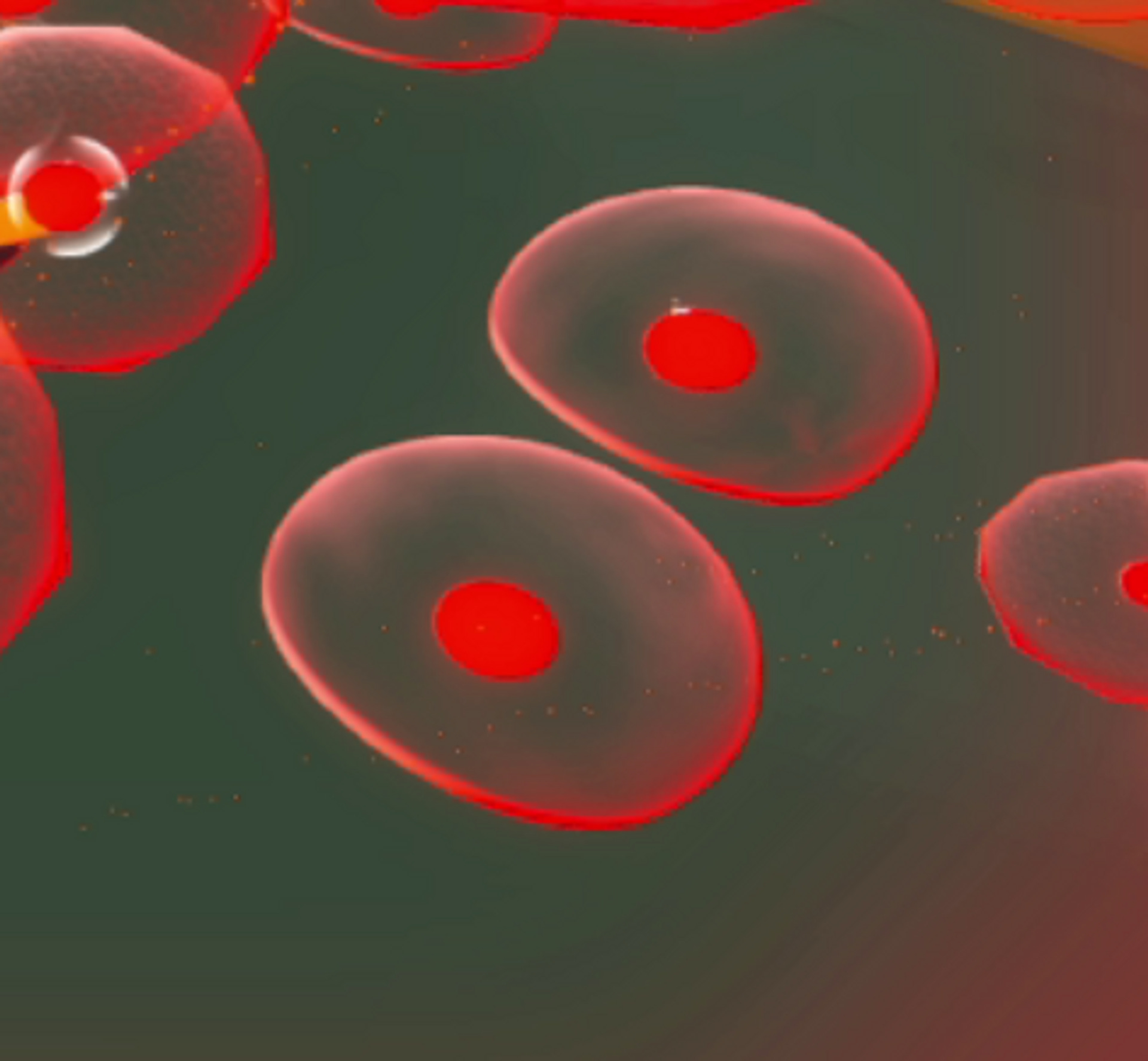
Each projectile was rendering a default sphere mesh, which is optimized on its own to be displayed, but when combined with a fresnel shader it was too intensive to be rendered en masse. Below you can see a sample of how many transparent intersection bubbles had to be rendered on the screen at once during a single frame of high intensity combat. Using this methodology wasn’t going to work.

I spent some time reading about optimization techniques, and came up with an optimized solution. If you look closely at the screenshot below you’ll easily notice that the majority of spheres actually have jagged, rough edges. These are actually not spheres at all, but hemispheres. They are also not using the intersection shader at all, and are all sprites. That’s right - I’ve fooled you, you fool! They were never meshes, what you’re looking at are a series of very very carefully built sprites, each of which is part of a particle renderer!
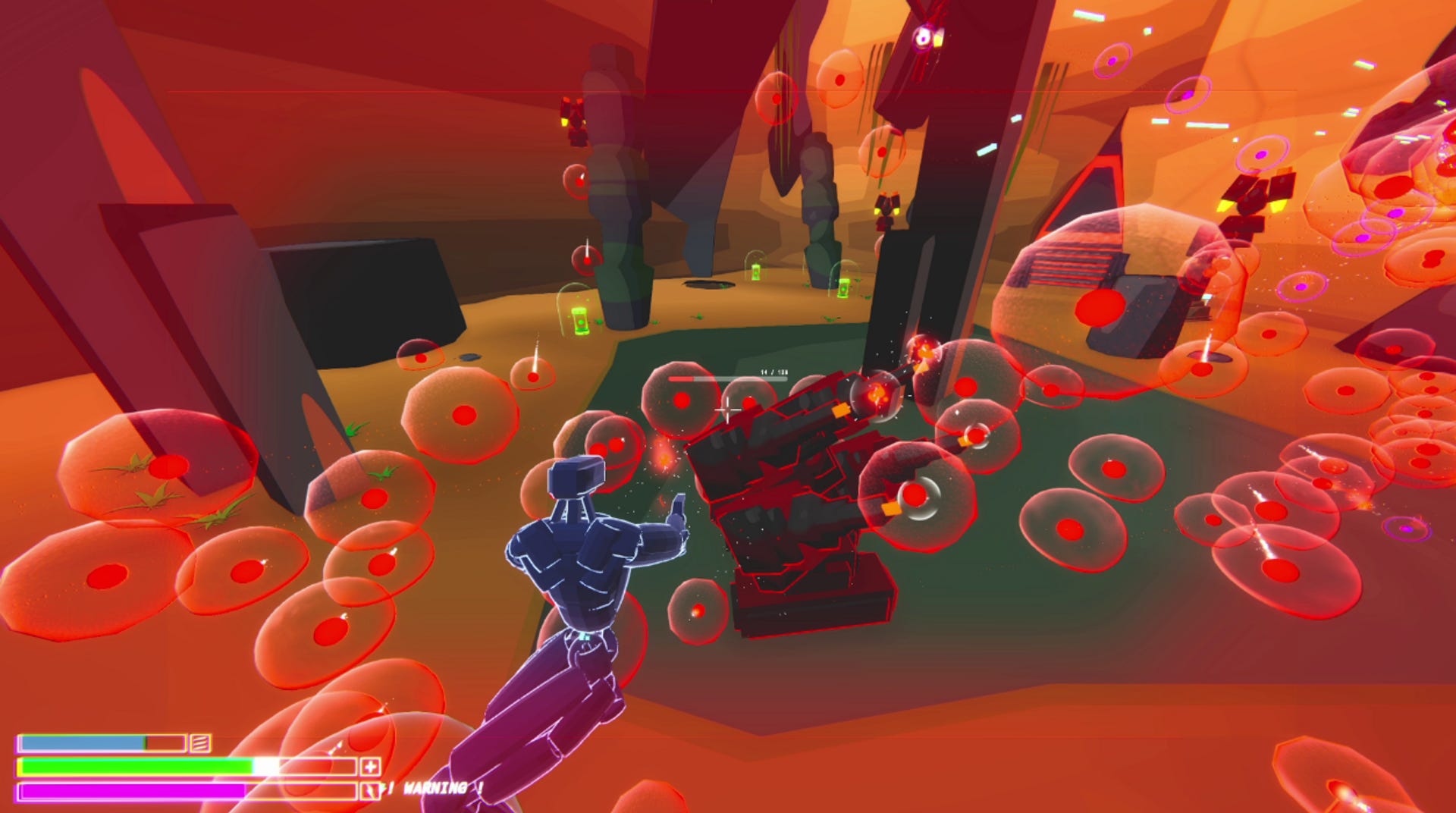
Unity’s particle rendering system is so robust and sound that I couldn’t help myself. I latched onto it and quickly began turning enemy projectiles into particle effects which mimicked their real counterparts. There are some real intersection shaders in here, mainly used to convey ground intersection for physics-based projectiles, but every linear projectile in the scene is simply a sprite painted to look like a projectile.
This instantly freed up a gigantic chunk of performance. I was effectively rendering 10% of the transparent objects than I was previously. From here optimizations began to take more simplistic shapes. I isolated objects which did not need high levels of fidelity or detail and were rendered quite a bit, and used vertex shaded instanced materials to render them more easily.
A quick example of this - below, in the screenshot on the left I am rendering all vegetation with a height-based gradient. This recalculates its shading every frame resulting in each individual vine or leave to be rendered one at a time. Below on the right I switched all vegetation to one instanced shader, allowing them all to be rendered as one object on a draw call.


Visually there is little to no difference, but the optimization benefits were well worth the change. I had to drop other live rendered aspects too, such as ambient occlusion, high definition shadows, and screen space reflections, because they would still make the game too intensive.
After a week of optimizing the rendering of this game, I managed to get it running on my laptop with a Core i7, 16gb of RAM, and a GTX 1060 at about 60 fps at 1080p. Once I had hit that point I considered this game optimized enough. Given more time I would have been able to increase it’s performance further (remove outline on objects that down need them, stop overdraw, bake meshes into one to be rendered on a single draw call) but for the time I had to work with and the objective I was given, I would consider this a great success.
Moving on from Rock Hopper, I started over and began working on Praetor. Praetor is the sequel game to Rock Hopper, carrying forward everything I learned from playing it. However, Praetor was only an advanced prototype, which never made it to the stage of full art and visual design. The furthest I had gotten was creation of test assets and art tests, which incorporated different aspects of materials an design techniques to create assets. One huge contributor to the feeling of movement in that game was the addition of context. When the environment gained more details, the perception of your movement speed was significantly more visible, thus adding to the feel of the world.
In this example above the player is moving at quite a fast speed, but that speed means nothing because of the blank environment around them. We see their legs move, the walls get closer, shadows move, and the environment get closer, but it doesn’t feel as if we’re moving very quickly. Even though these spaces are quite large and we are moving through them at extremely fast speeds, we are feeling the inverse effect: due to the lack of context, the player is extremely slow.
This is the first art test I performed in which the player’s speed was immediately perceptible. Even though this small map is barely one fifth the size of the larger maps above, and the player is moving at the exact same speed, it feels as though they are moving faster due to the additional context of their surroundings.
From this test I took away one key factor: Whatever art style I pursued in the future had to feature a high enough level of detail that it could capture the much needed context of the environment, and translate that into a measurement for the player’s momentum. If I can tell the player how fast they’re moving by showing them, then I’ve succeeded. With this in mind I got to work on creating several other high detail art style concepts.


These two tests were done using a series of substance smart materials I had made, and many substance designer materials. Each pursues a vastly different visual style. On the left I explored the use of low-detail cartoon textures, to explore what wide-spaced context looked and felt like in this area of design. I then added edge and scattered rust masks to the layer of moss, spent some time refining the curvature map, and then fixed the normals and roughness. I considered this style for a while, but it was too difficult to get right across a vast array of objects.
On the right I looked a more high-density approach to visuals where the objects and materials in question were focused significantly more on realism rather than stylization. In this case I moved to heavily opt for high density bakes of normals, ambient occlusion, roughness, curvature and inverted curvature, a much higher level of “grit”, and a much more drab color palette. This reminded me heavily of many FromSoftware games, such as Dark Souls. The low color high density style is quite busy but conveys very little information.
As I said before this version of Praetor was abandoned in favor of a different unreleased prototype: a roguelike bossrush where you only lose abilities. In this case I was tasked with creating one high detail arena, and began making conceptual environments to see how they would feel. The most successful and influential one was the arena which made it into the playtest builds, seen below.

This map uses a few key components to deliver its vibe. The first and most obvious is the high quality lighting. In this scene I’m using a combination of emission materials and area lights to build global illumination. These smooth gradients of light add a very nice environmental ambience to the arena, and establish a visual language even on texture-less faces.

In this video I showcase how I used high poly baking to texture objects and give them pseudo geometry. High poly baking is a common concept in the world of 3D production. The core idea is that you are adding geometric details as a normal map rather than as a polygon, so you’re not actually rendering anything other than a flat face. I was able to use this as a tool to build higher quality assets without sacrificing performance. As you can see from the video, the faces of the object react to light and reflections as if they are 3D even though they are a flat rendered face.
Taking all of this forward - I decided to start again once more, and built what we know of today as Godwalker. When I started over I did not have enough time to properly build and texture a map, so I created a set of textured 12x12x12 objects to be used as a temporary prototyping kit in Unity. To help more, I reused some more environmental assets, such as the pillar, to quickly build a new prototype that had proper context for movement.
Even though (in the video above) you are not moving very fast (you are in fact, slower than the previous iteration) the game feels as though it is extremely fast paced. This early prototype would not have felt the same had the textures not been in the state they were. Speeding through this space at high speeds through chaos feels as good as it does in part by the high level of detail you’re whizzing past.
I continued to add and refine details in the environment, and attempted to scale all details to a relatively similar density. Keeping a consistent texture density helped to judge how far certain distances were to move. This meant that even in a map such as the one below, players could judge how far away a jump was by more than just the edges of a box.

Establishing and populating the environment with visual language has been key to making this game feel as good as it does. One huge component to the platforming the player performs as they move through the world is how high and how far they are able to jump. Keeping the height differences and the gap widths similar lengths, down to a quarter of one length, has directly contributed to the readability and pathfind-ability for players in the environment. Density and size of grunge have greatly contributed to this as well.
Applying new concepts of density and size with old concepts of lighting and rendering I began making different stylized environments to see what this game could look and feel like.

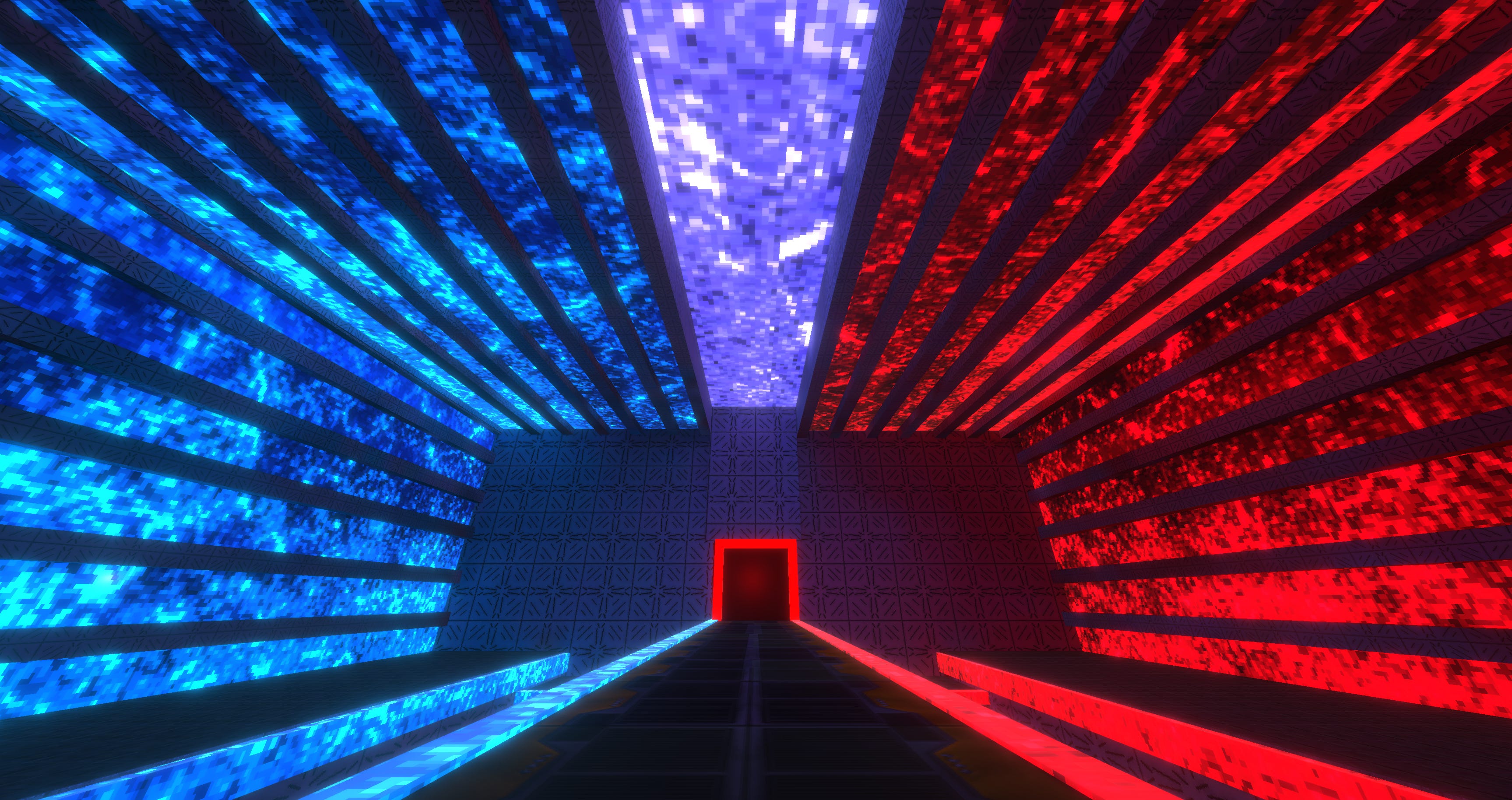
My first concept was a larger room with multiple layers and red light surrounding it on all sides. Even though this is a large space, the sealed off walls bring an element of claustrophobia to it. The tall but close ceiling makes the room feel thinner than it is. Red light streaming in on all sides brings a level of threat to the environment. This concept was one which I considered to be much more visually interesting than the previous maps, so I began exploring different kinds of uses of light in environments.

In this map I wanted to make a very small space with a series of platforms. To highlight the platforms and accentuate the small space I made the area black and non-reflective. Each pillar holds a platform, and reach platform is marked with a light, so that even in the low-light environment the surfaces which the player can jump to are visible. One major takeaway from this was how the darkness contributed to the small-ness of the space. Players quickly noted how small and tight this environment was, even though many others which shared a similar size to it with different rendering methods got completely different responses.

For the final area of this demo I wanted to play with an indoor environment lit from a single light. In this case that light the lava which fills the room with red light that bounces off of the walls. Focusing mainly on density here, I resized objects to fit their environment drastically, and used my level kit to construct an environment which felt, in shape, texture, and rendering, like a stone temple. Paths in this space are clear, the visual structure and language are established upon entry, and of all the maps I had made thus far I felt this one was the most visually appealing. It used the majority of the concepts I had explored in environment design, and functioned as a spring board for the style I am exploring currently.
But before we jump into that, I performed a few more art tests to experiment with laterally different, less stylized styles. I had again found myself pursuing an art style which was unique, efficient, and refined.
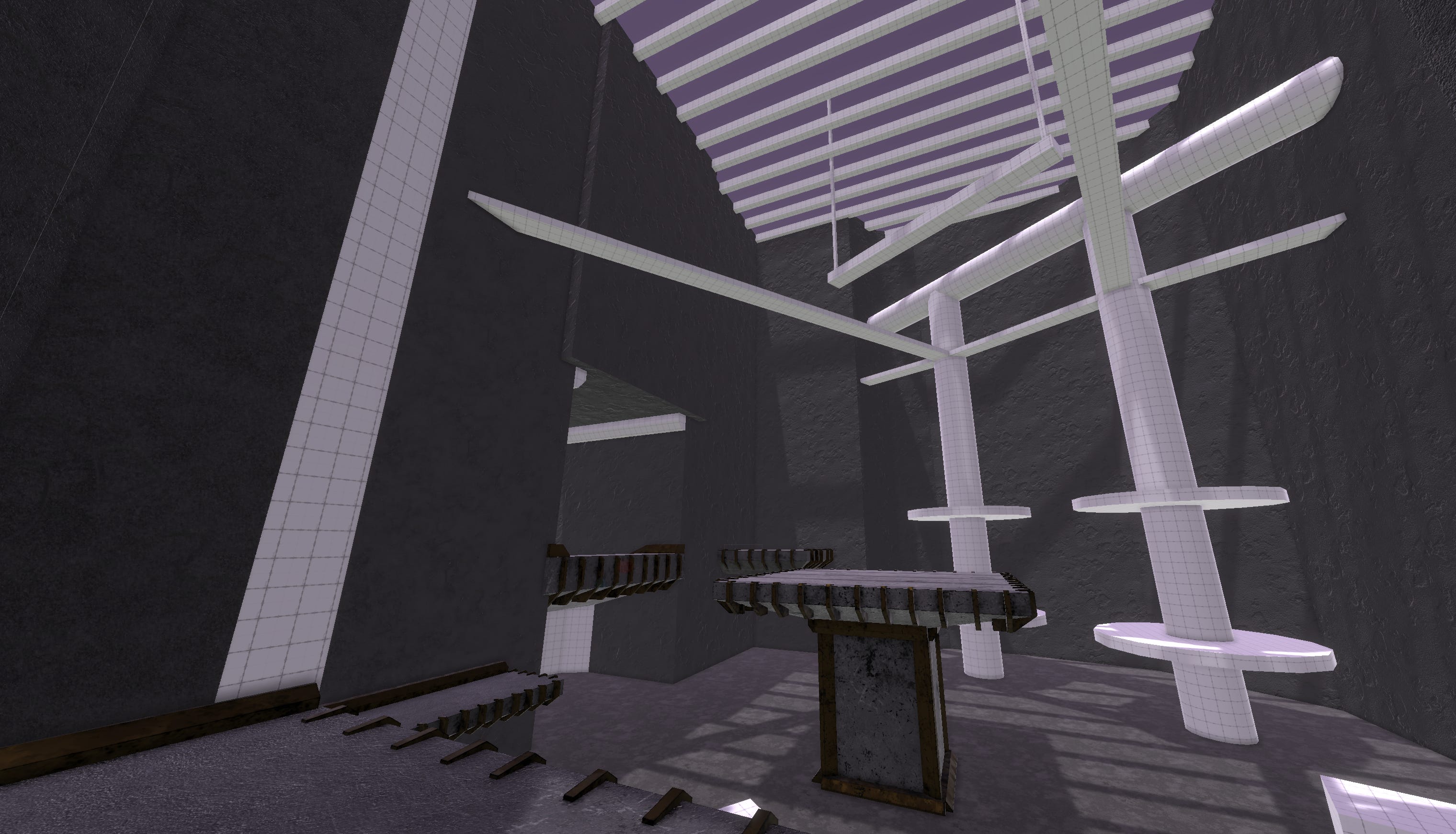
Below is the concept map I used to test my different styles. It was a simple ProBuilder made map consisting of smooth and hard edges, with some angular and abnormal elements to experiment with.

Whitebox of the test map
One methodology I explored was using Substance materials directly in Unity, allowing me to quickly drop them into the scene, and fill it with textures in less than ten minutes.

Substance material driven environment
This production pipeline was unfruitful, though, because it did not allow me to properly customize and individualize objects. Everything felt un-flavorful and blown out. Objects had detail, but those details repeated and patterned themselves all over the environment, making it feel soft and empty.

Manually textured central pillar
Unsatisfied with my first test, I decided to manually texture an object to see how long it would take. Using smart materials and an efficient export pipeline I was able to quickly dress the map’s platforms in just under two hours. Efficient, but not efficient enough. Going this quickly was exhausting, and I wasn’t even able to properly include individualized details in the map.

In an effort to save time, I build every bespoke element of the environment and then used Substance materials to cover larger pieces such as the floor and walls. This eventually amount to something which looked mildly okay considering how long it took to put together.
Drastically unsatisfied with my cost to yield, I paused on this style and took a step back. I reconciled my explorations into color, shape, lighting, and rendering. From there I pushed in a very drastic direction just to see what would happen.

I colored the environment with vertex only shading, added emissive materials, and then baked their lights into the walls and floor. While I felt this was too neon, and the coloring itself was too jaded, the core conceit of what I was trying to accomplish was in practice: context without reliance wholly on textures. In this space the shape, color, and rendering of objects provides the context you need to feel as though you’re moving through it. Even though this environment is quite smooth, it still feels good to move through.
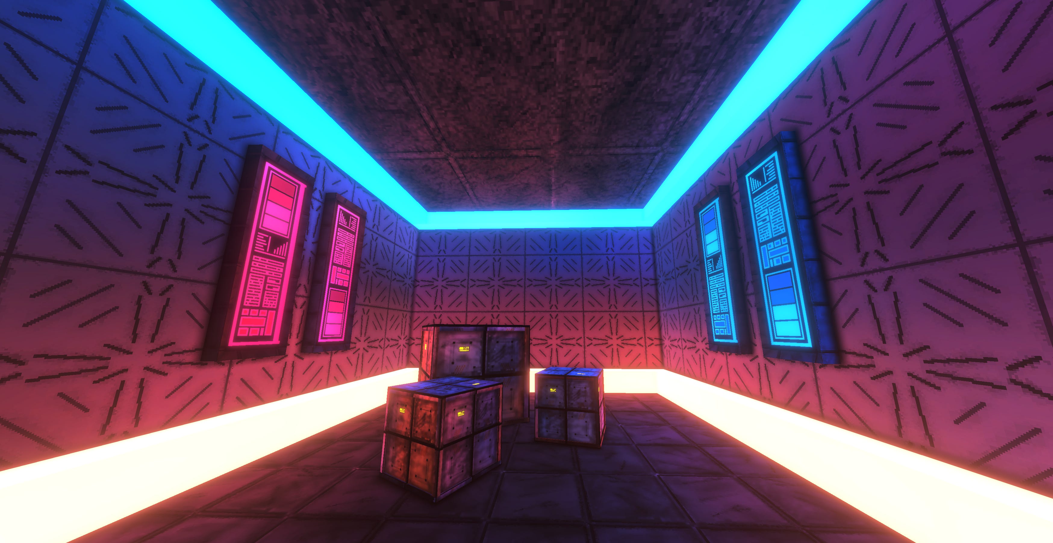
After a few different rocky tests, I began experimenting with what I am delineating as an art style known as “Forced Constraints.” I’m definitely not the first person to come up with it, but I couldn’t find a name for it. The idea of a forced constrain art style is that the artist attempts to emulate a game’s art style from an era when resources didn’t allow for extremely high detail artwork. Ultrakill, Dusk and Prodeus use this as a signifier of their callback status, reminiscing about the days of boomer-shooters of old. I decided to try something similar here, and had immediately felt as if I’d struck gold.

In the screenshot above I had placed in a bumpy normal map over the untextured material (the only thing being rendered on the floor is how bumpy it is, but I made the bumps pixelated). This alone without any textures only reacting to light and color from the environment was providing a type of context that felt unique and really interesting to interact with. Because it is a normal map and not a texture, the pixelated bumpiness shone differently from other angles as light bounced off of it.
Moving through these environments had a faux-dynamism to them. These walls and floors were pixelated, reinforcing the idea of a forced constraint, but the way they interacted with the lighting of the room made them feel extremely unique. I began dropping in more drastically shaded normal maps of stones and gravel, and kept on getting extremely interesting results.


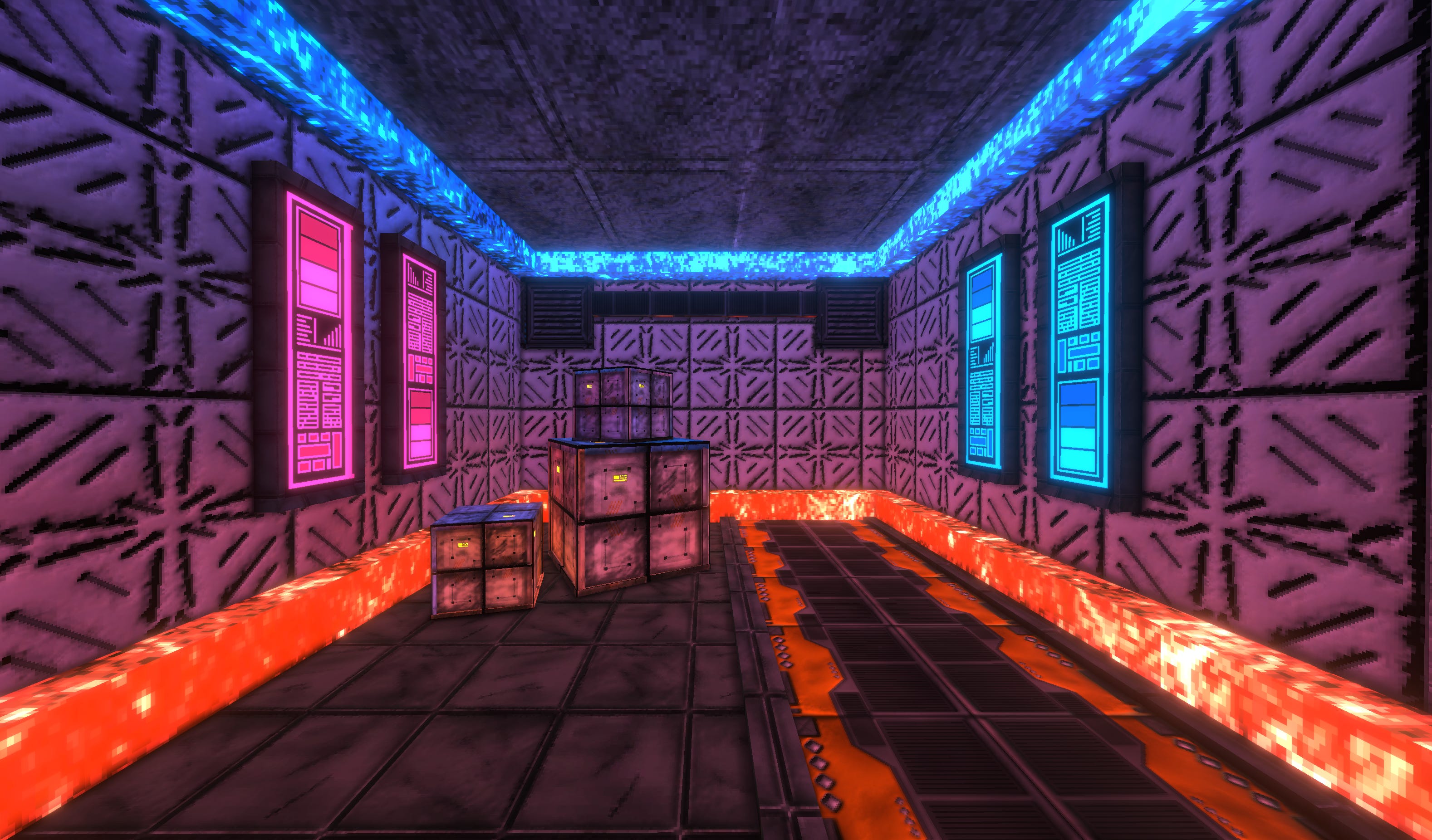
I continued to apply this concept and added these same maps to emission channels and baked lights using them. This led to a more randomly distributed lightmap, giving the scene more depth.
Following in the same pixelated path, I made a test texture in Aseprite to mimic a pixelated art style. My first test was a success, and I had made a grungy and grimy crate.

On its own this may not look like much, but after butting my head against a wall for months on end, finally finding an artistic style that was unique, efficient enough, and almost commercially viable, I felt more encouraged to explore it. The reward of my hard work was, ironically, the ability to do more work.
I tested additional floors and walls, using color and normal maps to elevate their smaller more hidden details.


From here I began to pursue a smaller high detail reference render from which I could base more of the game off of. I went through several different lighting techniques and eventually settled on a more balanced one for visual clarity in the environment. However, I built several maps around the original lighting concept rather than the newer one.

Using this new style, I created a series of visually distinct maps, each using a different set of color toning and environmental lighting. These are now in the most recently Godwalker build.


My exploration is constantly shifting and changing as I explore new sub-styles within this one, but I finally feel as though I’ve found a vibe that compliments the action packed high octane gameplay. As I continue, I will be building different assets for the environment and attempting to fill them out with more minor details to create a more refined final product.